Sankey Charts: The Unsung Hero of Student Data Analysis

Let’s face it—data can be a bit dry, especially when it’s a sea of numbers, tables, and long spreadsheets that can make your eyes glaze over. But what if you could see the movement of student achievement across proficiency bands as a dynamic, flowing story? Enter the Sankey chart, the hidden gem of data visualization.
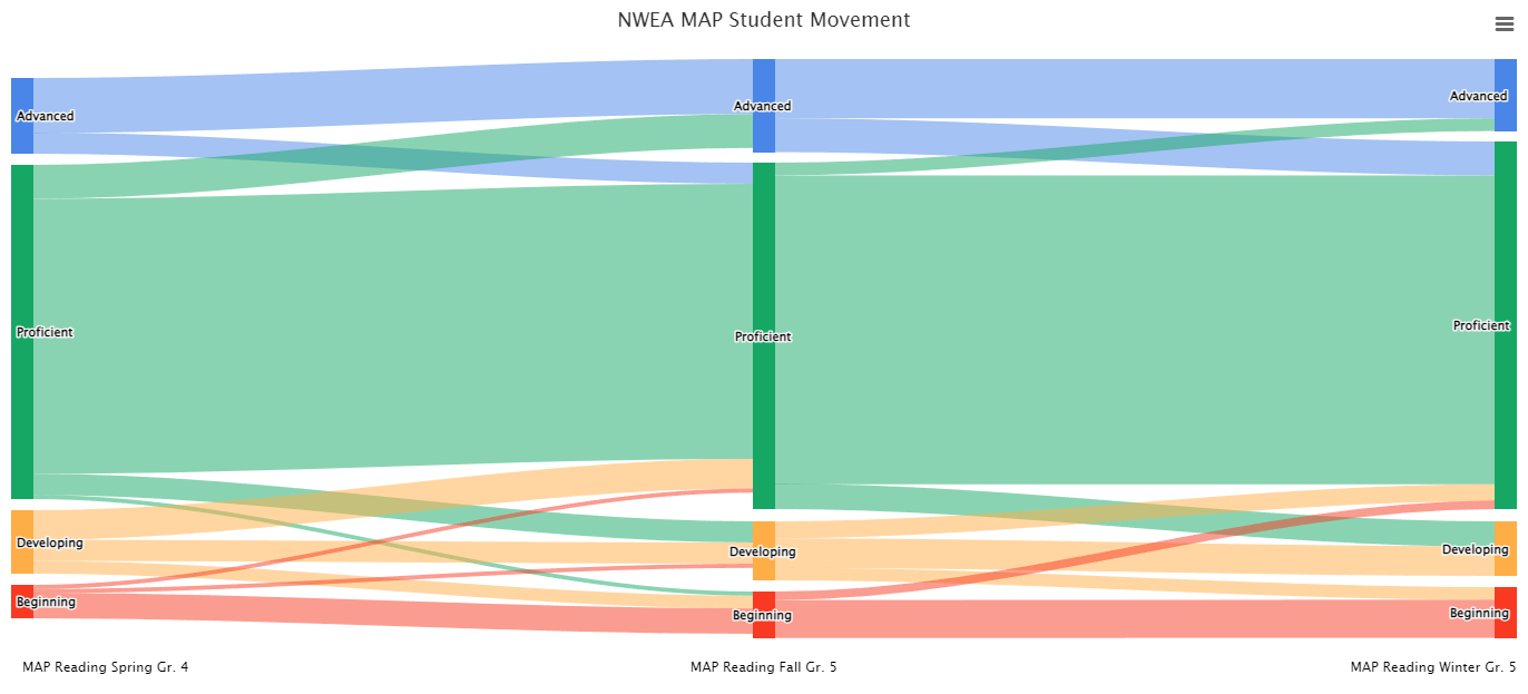
For those unfamiliar, a Sankey chart is like a roadmap for where things go, with big, bold arrows showing how “stuff” (in this case, students) moves from point A to point B. While it’s been a go-to in the world of energy or economics to show, say, how electricity flows from power plants to your hair dryer, Sankey charts have made their way into education—and we couldn’t be more excited!
At ion, we’re proud to offer Sankey chart visualizations, and our customers love the way these charts demystify how students flow between proficiency bands over time. Imagine being able to see how students move from "Basic" to "Proficient" or maybe from "Advanced" to... well, maybe we’ll just call it the "Needs Some Extra Love" category.
Let’s explore how these visual wonders can provide actionable insights and why you should be paying close attention to them.
The Power of Movement: What a Sankey Chart Reveals
A traditional proficiency report might tell you how many students are in each band for a given test year—good info, but static. What happens next? How do students progress—or regress—over time? That’s where the magic of the Sankey chart comes in.
Here’s a scenario: After a round of assessments, 100 students fall into three proficiency bands—Basic, Proficient, and Advanced. But the story doesn’t end there. A year later, these same students take another assessment. Some of the Basic students have moved up to Proficient, some Proficient students have advanced to the next level, and maybe (sigh), a few Advanced students have slipped back. A Sankey chart will show this movement in an elegant, flowing series of arrows. Each arrow's width represents the number of students making that move. You’ll be able to see:
- How many students jumped from "Basic" to "Proficient"—those success stories you want to celebrate.
- If any "Proficient" students slid back to "Basic"—perhaps highlighting areas where intervention is needed.
- Whether your "Advanced" students stayed on top or if there’s a concerning trend of regression.
By visualizing this movement, you’re not just looking at a snapshot of student achievement—you’re watching the story unfold.
Real-World Examples: Making the Most of Sankey Charts
1. Identifying At-Risk Students
Let’s say you’re a school principal reviewing math assessment results. You notice a significant number of students in the "Proficient" category last year have slipped to "Basic" this year. The Sankey chart not only shows this but also highlights which grade levels are experiencing the biggest regression. This insight allows you to pinpoint interventions quickly and focus resources where they’re needed most.
2. Tracking Progress of Intervention Programs
Maybe your district has implemented a new reading intervention program. You’re eager to see if it’s working. With a Sankey chart, you can visualize how students in "Basic" last year have moved to "Proficient" after the intervention. If you see a strong, thick arrow showing a significant number of students making this leap, it’s evidence your program is effective.
3. Understanding Grade-Level Shifts
Let’s say you’re analyzing science scores across multiple grades. You may discover that 6th graders who were "Advanced" in 5th grade are now slipping back into "Proficient." The Sankey chart highlights this decline, prompting a closer look at the curriculum or teaching methods in 6th grade that may need adjusting.
How to Interpret a Sankey Chart (Without Feeling Like You Need a PhD)

At first glance, a Sankey chart might look like abstract art. But once you understand the basics, it’s a breeze:
- Nodes: These are the proficiency bands (Basic, Proficient, Advanced, etc.) that represent the categories of student performance.
- Flows: The arrows connecting the nodes. The width of the arrow tells you how many students are moving from one band to another.
- Color Coding: Often, the colors in a Sankey chart can help highlight certain flows—maybe green for improvement and red for regression.
The key thing to remember is this: the wider the arrow, the more students are making that particular move. So, if you see a big, bold arrow moving from "Proficient" to "Advanced," go ahead and high-five your team. But if you notice a thick arrow going in the opposite direction... well, you know where to focus your energy.
The Sankey Advantage: Why Our Customers Love It
At ion, we’ve integrated Sankey charts because we know that educators need more than static data—they need stories, movement, and a clear path to understanding how students are progressing. Our customers love that these charts give them an instant visual summary of student movement between proficiency bands, making it easier to spot trends, assess program effectiveness, and make data-driven decisions.
But beyond the functionality, there’s something deeply satisfying about seeing the dynamic journey of student achievement unfold before your eyes. Whether you’re a superintendent overseeing district-wide performance or a principal laser-focused on a single grade level, Sankey charts transform complex data into an intuitive, easy-to-interpret tool that brings insights to life.
Wrapping Up
Sankey charts take your typical data analysis and give it an upgrade—helping you see how students move through their educational journeys. Whether you’re celebrating student success or spotting areas for improvement, this visualization tool offers a clear, compelling way to understand your student data in a whole new light.
Ready to see the power of Sankey charts in action? Sign up for a demo today and discover how ion can transform the way you understand and leverage student data. With our full-service solution, you'll have all the insights you need at your fingertips—no technical expertise required. Let’s make your data work smarter, not harder.