From Insight to Influence: Crafting Data Stories for Your School Board
Imagine this: You've spent weeks collecting student performance data, attendance figures, and engagement metrics. Your analytics tool has run its reports, generating a mountain of numbers and charts. Now, it's time to present your findings to the school board to secure resources for an essential new initiative.
But here's the kicker—raw data alone rarely inspires action. The board isn't moved by spreadsheets and tables; they're moved by stories. Let's take a closer look at how to transform dense analytics into compelling narratives that resonate, motivate, and secure board approval. We'll also explore how a robust platform (like ion Analytics!) can serve as your trusted partner in this storytelling journey.
Step 1: Uncover Your Storyline
Let's say your school's analytics reveal a troubling drop in reading comprehension scores among sixth graders. At first glance, the numbers might not seem particularly dramatic—just a steady, subtle decline. But behind those percentages are real students whose academic futures could be changed with additional support.
Your job, then, isn't just to present data but to craft a narrative. Ask yourself:
What's the issue? ("Sixth graders are struggling with reading comprehension.")
Why does it matter? ("Reading comprehension impacts all subjects and directly influences student confidence and long-term academic success.")
What's at stake if we don't act? ("We risk creating a widening achievement gap, affecting graduation rates and future opportunities.")
Once you've clarified your storyline, you're ready to move from numbers to narrative.

Step 2: Visualizing the Data
Now comes the fun part—visualizing your data in a compelling, accessible way. Let's face it, numbers alone often induce glazed looks, but visuals tell stories that stick. Consider these visuals:
- Line Graphs: Clearly highlight the downward trend in reading scores over time, making the decline obvious.
- Heat Maps: Show variations across classrooms or schools to pinpoint exactly where intervention could have the most impact.
- Infographics: A quick snapshot that summarizes why intervention matters ("Every 5% drop in reading comprehension scores correlates to X% drop in high school graduation rates").

Step 3: Humanize the Data with Personal Stories
Numbers can illustrate trends, but personal stories create empathy and connection. Consider incorporating a short, impactful student example (anonymized) to highlight the human side:
"Last semester, we met ‘Student A,’ a bright sixth grader whose potential was hindered by comprehension struggles. After three months of targeted reading support, his test scores improved by 15 percentage points, and his confidence soared. Imagine the impact we could have on dozens more students just like him."
Now, your data-driven narrative is both emotional and actionable.
Step 4: The Call to Action—Clear, Specific, and Motivating
You've laid the groundwork. You've presented visuals that resonate and stories that touch hearts. Now, close strong with a clear call to action. Be precise:
"We're asking for funding to launch a targeted reading intervention pilot for sixth graders."
"We recommend hiring two additional reading specialists and investing in new literacy software."
"Your approval today will directly impact student outcomes, improve test scores, and build the foundation for lifelong academic success."

How ion Powers Your Storytelling
Crafting these narratives doesn't have to be daunting. With ion behind you, the heavy lifting is already done:
- Instant Insights: Quickly identify trends without hours of manual analysis.
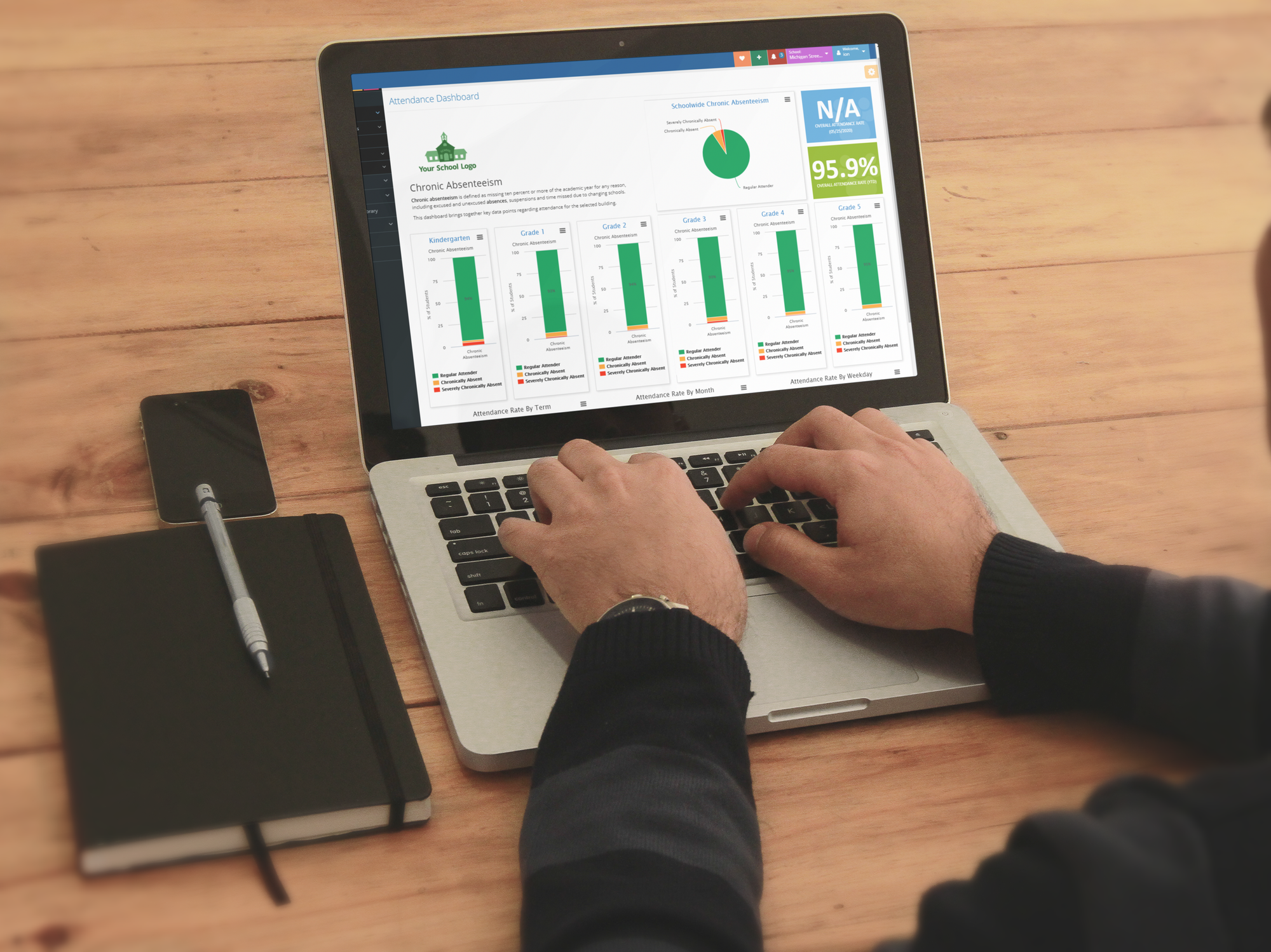
- Intuitive Dashboards: Generate compelling visuals in just a few clicks.
- Data Accessibility: Share clear, engaging reports that board members can easily digest and understand.
Your data isn't just numbers—it's potential. Ion helps you unlock that potential, enabling you to present analytics-driven stories that secure resources, inspire change, and positively impact students.
Ready to Inspire Action?
Next time you're preparing for a school board presentation, remember this: Data becomes powerful when it's part of a compelling story. Define your narrative clearly, visualize effectively, humanize with impactful anecdotes, and conclude with an actionable call to action.
Backed by a powerful analytics platform like ion, you'll move your school board from insight to influence—and see your proposals approved.
Ready to bring your data story to life? Reach out today—we'd love to help you get started.
